
Keep your interface simple, stupid.
Okay okay, you’ve probably heard this phrase eleventeen times… but it really IS your golden ticket to great usability in design! Are you a designer that is guilty of over-complicating things? Over-analyzing things? If so… Whew! Guess what? You’re not the only one.
If you also have at least 42 tabs open in your brain (and in your browser) at any given time, I recommend that this good ol’ saying be a constant reminder in your design process. Put it on a sticky note ;)
I typically start off with way too many things in my early prototypes— too much content, too many icons, too many colors, too many options, too many this, too many that. (It’s ok, I’ve learned that it’s part of my brainstorming process and whittling down to clean, engaging and intuitive designs!)
This practice is like taking my “monkey mind” through meditation… in the end I’m left with far more clarity than I began with. Simplify, condense, and do it all over again until you reach that “ahhh there it is” moment.
But why is simplicity so important in user interface and user experience design? Because when things are expected, they are intuitive. Consistency with common elements equals satisfaction and engagement. Complexity and choice fatigue equals anxiety and disengagement. We want our users to navigate with ease, make informed decisions, and enjoy the experience too right?
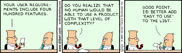
How often have you opened up an app or website, or used a product that left you ready to toss your computer (or the product) out the window because it was confusing and you couldn’t reach your end goal? *guilty.
Poor user experience is typically the result of too much complexity and not enough clarity in the user interface.
And note: just because a user interface looks nice doesn’t always mean it functions well… You can have a gorgeous interface but if your users can’t figure it out, they aren’t likely to push through their frustration to keep using it.
“A user interface is like a joke. If you have to explain it, it’s not that good.” - Martin LeBlanc
Always be on the lookout for ways to reduce clutter in your UI and create more balance— through grouping and hierarchy… simple, short tasks… and spacing! Like meditation needs breath, your design needs room to BREATHE!
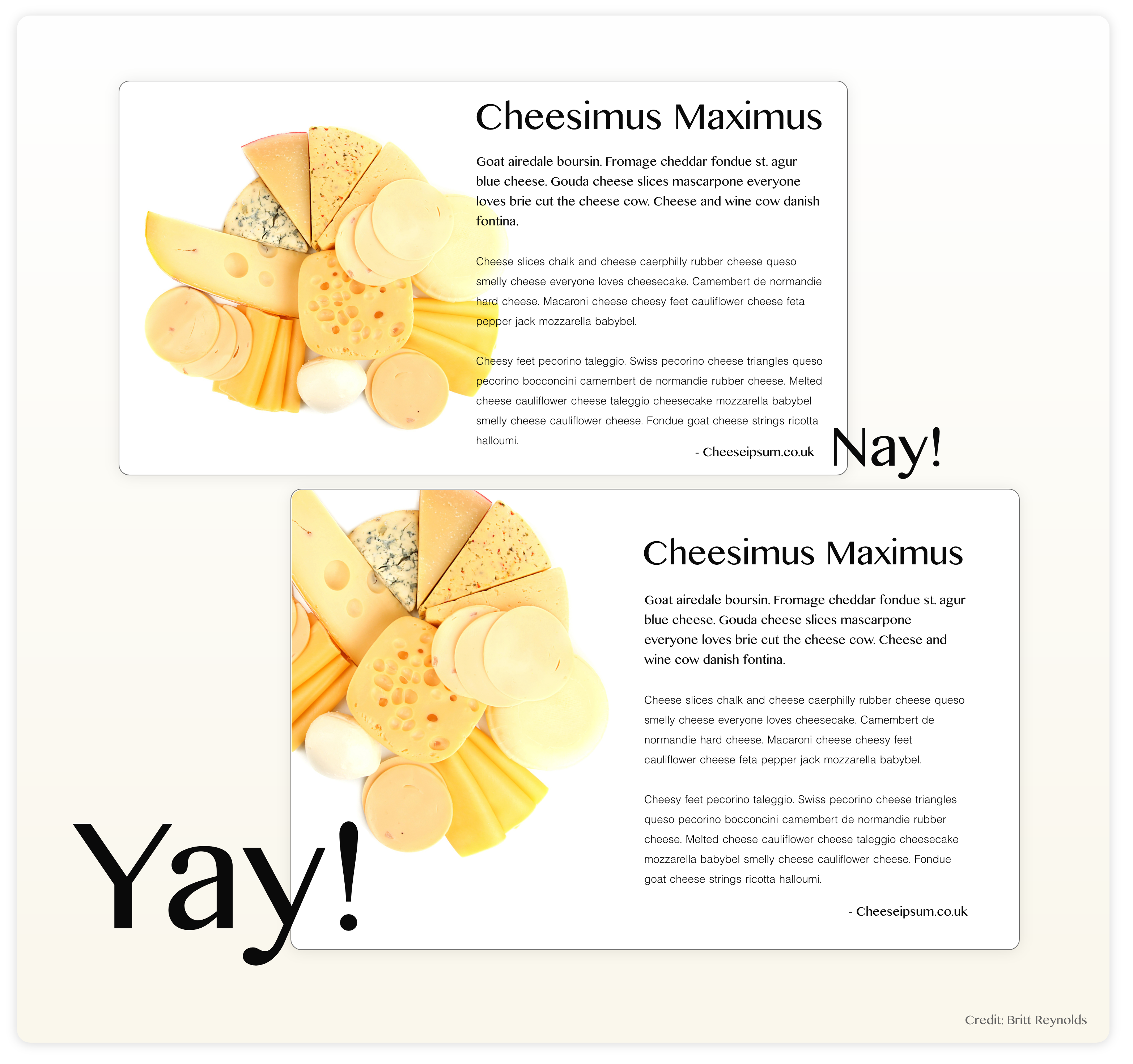
These are just a few ways that can help to maximize functionality, while still maintaining simplicity and preventing information overload. Having a help center for your app, site or product is beneficial… but aim to design in such a way that users rarely have to resort to using it! It should be the backup, not the go-to.
As always, testing designs early and often will provide the best insights to areas of friction with your user interface and your user’s experience. The most glorious words you can hear as a designer from the mouths of your users is “I loved how easy it was to use!” and “that was really intuitive”.
In a world where we have immeasurable options, it is our duty as designers to make digital experiences as effortless and painless as possible.
A simple interface is good for your users and good for business.
Don’t be stupid… keep it simple.
Do you have an idea for an groundbreaking new app? Here at Aptus, we have a diverse team of engineers, developers, and creative designers ready to bring your idea to life! We'd love to work with you. Schedule your introductory project meeting now!


